
- Shopify
- Shopify Liquid
- JavaScript
- CSS
- Shopify Theme Editor
On this page
Context
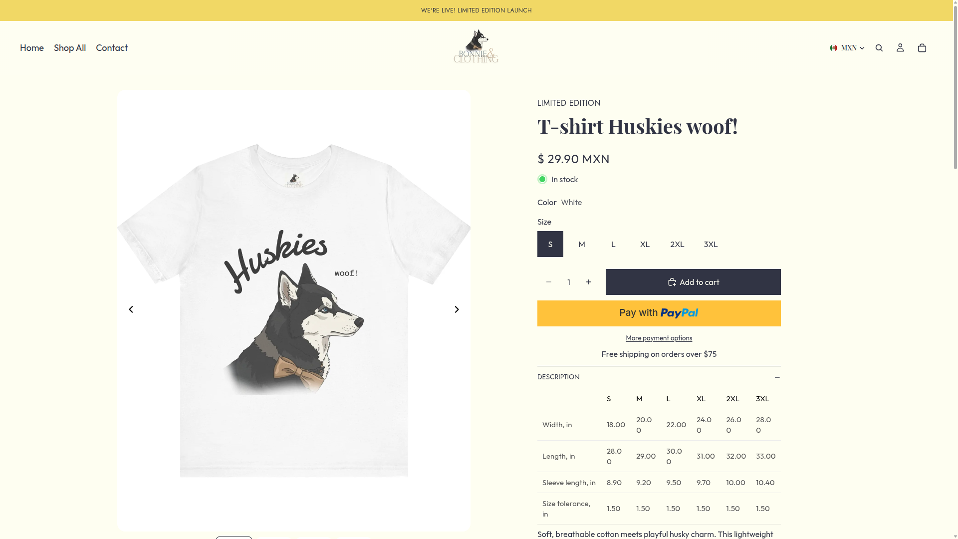
Bonnie & Clothing is developing a Shopify storefront that moves away from the appearance of a standard theme and reflects the brand’s specific visual direction.
The project focuses on translating that identity into a responsive shopping experience while extending Shopify’s presentation capabilities without making everyday content and merchandising updates dependent on a developer.
The Challenge
A highly customized Shopify theme can easily become difficult for the merchant to manage. Visual elements may be hardcoded into individual templates, similar components can behave differently across pages, and routine updates may require direct changes to the codebase.
The central challenge is to create a storefront that feels specific to the brand while preserving the editing tools the client needs to update content, reorganize sections, and adjust merchandising priorities.
The interface must also balance product imagery, collection discovery, navigation, and purchase actions across mobile and desktop screens. On smaller devices in particular, the layout needs to preserve visual impact without obscuring important product information or making the shopping flow harder to follow.
The Solution
I am building the storefront as a modular Shopify theme using reusable Liquid sections, snippets, configurable settings, and shared CSS patterns.
This approach allows the visual identity to extend beyond the limitations of a generic theme while keeping recurring content manageable through Shopify’s Theme Editor.
The current work focuses on typography, product presentation, image behavior, collection browsing, and clear transitions from discovery to product selection and checkout.
Technical Approach
Modular Liquid Architecture
Page content is organized into configurable sections and blocks that can be reordered, hidden, or updated through Shopify’s Theme Editor wherever the design permits it.
This gives the merchant greater control over campaigns, featured collections, editorial content, and page composition without requiring code changes for routine adjustments.
Reusable Theme Patterns
Shared Liquid snippets, section structures, and CSS patterns are used for recurring interface elements rather than duplicating similar markup across templates.
This makes behavior more predictable, reduces repeated code, and allows visual changes to be applied more consistently as the storefront expands.
Responsive Storefront Behavior
Layouts, image treatments, navigation, and interactive elements are designed with smaller screens as a primary consideration.
Important product information and purchase actions remain accessible without depending on hover interactions or desktop-specific behavior. Desktop layouts then use the additional space to expand the presentation rather than introduce a separate experience.
Native Shopify Workflows
When a requirement can be handled cleanly through Liquid, theme settings, metafields, metaobjects, or Shopify’s existing storefront features, I prioritize those options before introducing an additional application.
Custom code is not used to replace every app by default. The decision depends on whether an app provides meaningful operational value or would add unnecessary cost, duplicated functionality, or storefront overhead.
Key Engineering Decisions
- Design for the merchant as well as the customer: Keep recurring content editable through Shopify’s native tools wherever practical.
- Use modular theme structures: Build reusable sections, blocks, and snippets instead of relying on hardcoded page templates.
- Limit unnecessary dependencies: Evaluate whether new functionality requires an app or can be implemented more cleanly within the theme.
- Prioritize mobile usability: Design browsing, product discovery, and purchase actions for smaller screens before expanding the layouts for desktop.
- Centralize recurring styles: Use shared typography, spacing, and component rules to reduce differences between templates.
- Preserve brand-specific details: Allow the storefront to feel tailored without making every visual element a one-off implementation.
Current Progress & Direction
The project is currently in active development. The main theme structure, reusable visual patterns, and responsive foundations have already been established.
This foundation provides a consistent starting point for the remaining product, collection, and merchandising work while keeping the storefront manageable through Shopify’s native editing tools.
The next stages continue refining product presentation, storefront interactions, responsive behavior, and the details required to translate the brand’s visual direction across the complete shopping experience.
What the work established
Initial Theme Development
The modular theme structure and responsive storefront foundation were established during the initial six-week implementation phase.
Modular Liquid Sections
Reusable sections and snippets reduced duplicated theme code and created a more consistent implementation across templates.
Merchant-Controlled Content
Content remained editable through Shopify wherever practical, allowing routine merchandising changes without developer support.
Project gallery